Microsoft: Email Design System
Microsoft: Email Design System
Creating a design system for the Azure email orchestrator team

The Azure Email Orchestrator (AEO) team builds, tests, and sends the email traffic, both internally and externally, for a number of Microsoft brands. They needed a dedicated designer to create new email templates and update old templates while simultaneously building a unique design system to help achieve two goals: (1) create more visually cohesive and effective email templates and (2) streamline the production process from design to development. Below is a description of the three stages of my design process for building that design system.
Establishing Styles
This design system was going to be based off of existing styling that I and the designer before me had developed. Firstly, I formalized the styles that would make up the design system. There was the grid for both desktop and mobile, the type ramp, and the base color palette that could be used in conjunction with any brand color of AEO a specific client.
Building Components
Next, I cataloged every type of component from existing templates and then refined the designs of those, eliminating any discrepancies, and created new ones where necessary. During this process I also established an 8px spacing ramp because I realized that standardized spacing was a necessity to maintain consistency across every component. In retrospect, this could have been formalized before but the process of building components was instructive in displaying real edge cases that in turn better informed the constraints.
Web Pages
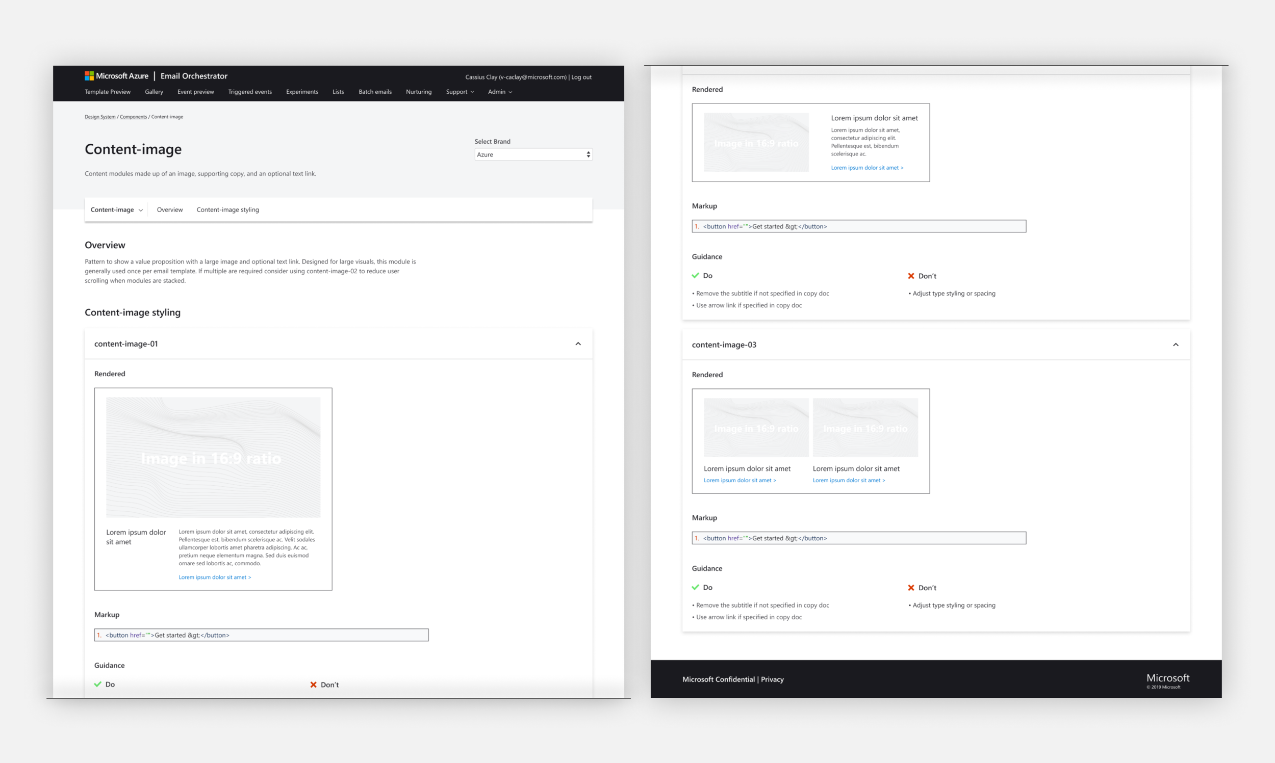
Lastly, I designed the web pages for each of the styles and components to be displayed on the internal team site. The purpose of showing all of the styles and components was to advertise the AEO team and its capabilities to all current and potential internal Microsoft brand clients.


